iOS Lock Screen UI Fail: Where Is The Contrast?!
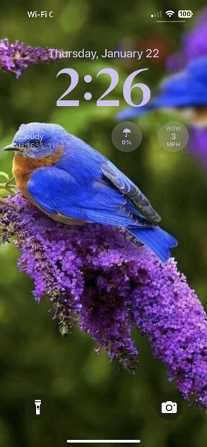
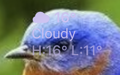
Screenshot of my iPhone’s lock screen, running iOS 18, January 2026. See the weather widget information? No, not the rain umbrella and wind speed circles… the temperature information. On the left, on the bird’s head. Here’s a closeup:
Apple Ignores Bug Reports—And Bugs
Reported this bug to Apple several years ago… iOS 16? 15? I don’t remember. Obviously they’ve not done anything about it, unless they made relevant changes in Liquid (Gl)ASS, which is its own set of WTF?! that i (so far) have no interest in exploring. I don’t ever use the current year’s Apple OS on any device until about a month or so before the next new one comes out. It has been my experience that it takes about that long for most of the bugs to be worked out, most often reported by We The Users.
Sorry, but Apple used to pay me to file bug reports. Since sometime in the early 20-teens, Apple stopped paying any attention to my bug reports, no matter whether i filed them through Radar (when that bug tracking system still existed) with my developer account or through the public Feedback interface. Now that in recent years bug reporting is built into newer OSes/hardware/development environments/i don’t actually know than what i own, the public interface is my only option.
They Know How to Fix This
This is a classic example of Apple ignoring bugs. We know they have all kinds of UI/graphics technologies to composite various text, graphics, and similar visual content in very fancy, generally appealing ways, which allow necessary information to be conveyed. Yes, of course I The User could select a different lock screen background picture, or edit this one manually. Why should i?! Safari (for one example) for years (at least on macOS) has been able to automatically blur/“frosted glass” web page colors and shapes behind the menu and other top bars in a way that strongly hints at what’s on the web page beneath yet does not interfere with the content of the menu/URL/search box/Favorites/Tab/etc. bars—dynamically, with page scrolling. You cannot tell me that they lack this ability for a static image lock screen photo stored on the device in such a way that the user’s randomly-selected and -positioned widgets which also are static once set up to in whatever combination be very selectively blurred, translucency-altered, Vibrancied (pretend it’s a verb), and/or processed however else such that the arbitrary widget content in its arbitrary position on the user’s arbitrarily-chosen lock screen image is completely, easily readable with minimal damage/distortion of the image.
Maybe i’ve got this all wrong. I was just a QA tester, not a software engineer, and definitely not a graphics expert of any sort. Seems to me:
- The code is in there.
- They’re not using it.
Then again, there is a long list of things about modern Apple Inc. that i do not understand.
))Sonic Purity((